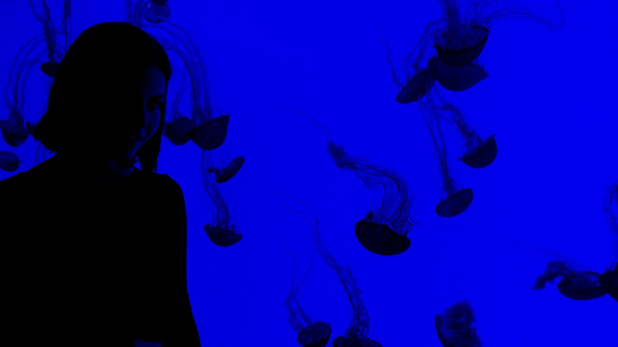
What can inspire new design trends and home aesthetics is incredible, like ocean-dwelling invertebrates that electrocute humans who get too close.
The most entrancing new home aesthetic is the jellyfish aesthetic, which dances on the grave of bland design styles that have reigned in recent years. I want to define this aesthetic and remind you that your home isn’t just for relaxation and peace; it’s also for joy and curiosity.
The Tides of Change
The days of low-rise skinny jeans and eerie minimalist mansions are winding down. Fashion and design are endlessly cyclical. We’ve left the sleek and minimalist era and entered the chunky, plump phase of the cycle — and I love it.
We all remember Kim and Kanye’s beige mausoleum of a mansion. Those kinds of bare, monochromatic designs are fading from the mainstream, and what’s left are funky shapes and vibrant colors. If this is the jellyfish aesthetic, that was the sand dollar aesthetic.
For all of you minimalist disciples, don’t fear, you can keep your beige walls and skinny furniture. But for all of you who have been gasping for color and playfulness in the last few decades, I’m happy to inform you that you can breathe the fresh and colorful air that is the jellyfish aesthetic.
Where Blobcore Meets Mermaidcore
Design is almost always derivative, so it’s not surprising that we can capture the spirit of the jellyfish aesthetic by blending two existing aesthetics or “cores.”
Blobcore is like if Play-Do was in charge of designing your house. It’s all about round, bulbous shapes that aren’t necessarily symmetrical. These objects can simultaneously look artificial and organic, making them funky works of art.
It’s as if someone took tasteful preschool furniture and gave it a touch of sophistication without stripping it of whimsy. Perhaps “kindergarten for grown-ups” is not an enticing style, but this aesthetic takes the endearing elements of child-focused designs and morphs them with groovy elements, creating a fiercely modern vibe that hits all the right notes.
Mermaidcore is similar to fairycore but has an aquatic aura. Like fairies, mermaid aesthetics are about sparkles, shimmer, and dreamy colors. Think glitter, gems, sheer fabrics, light materials, and cool hues.
The jellyfish aesthetic pairs the cheeky chunkiness of blobcore with the underwater mystique of mermaidcore to create a cute and ethereal style.
Let’s Channel Chihuly and Koons
Dale Chihuly, one of the most talented and inventive modern artists, captures the jellyfish aesthetic well. He creates contemporary sculptures by blowing glass into otherworldly shapes and eccentric colors that capture attention.
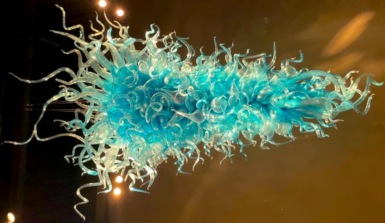
While this aesthetic can include many components that one cannot find in Chihuly’s work, his sculptures are a great starting point for understanding this design style’s whimsical and almost alien vibe.
Like jellyfish, his pieces feel organic, but also unfamiliar. It’s like looking at a plant from another galaxy. The earthly world of jellyfish can often feel like another realm, as they’re unlike most creatures we encounter.
When exploring this aesthetic, I encourage you to tap into that artistically uncanny place where the most unbelievable and unusual things exist in nature (like jellyfish).
Jeff Koons is another iconic contemporary sculpturist. His work often has the texture of inflated balloons, giving them a tautness and tension that is palpable, yet completely artificial.
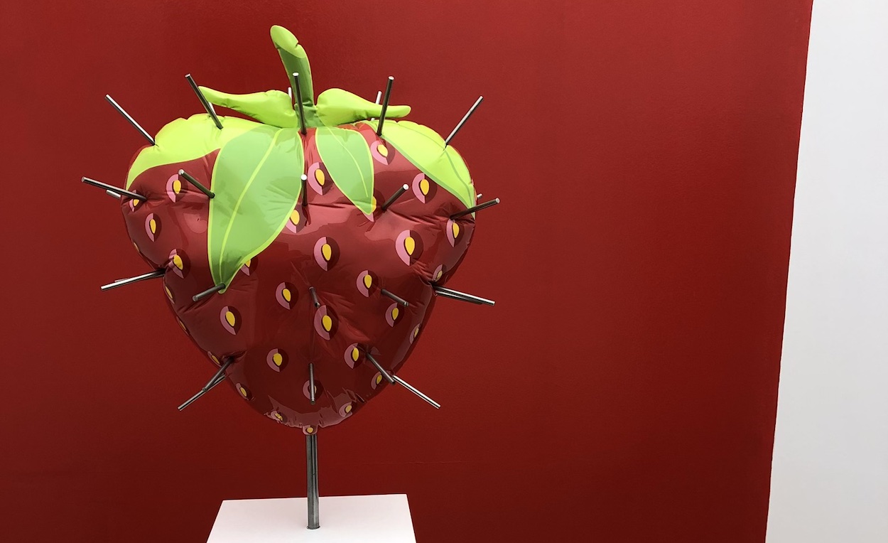
Much of his work’s plumpness and round quality capture the other half of the jellyfish aesthetic equation, which I’ll expound on below.
Squishy and Intricate Pieces
One of the more complicated aspects of this aesthetic is the pieces’ texture.
They can be delicate and intricate, like Chihuly’s glass sculptures, or bulbous and chubby, like Jeff Koons’ work. Some items can capture both, but those are tricky to find.
Achieving this aesthetic requires balancing these two textures. You can choose squishy textures for a more blob core or dainty pieces for a more artistic and sleek look.
Curvy and Fluid Silhouettes
Jellyfish are very fluid creatures. Their tentacles aren’t stick-straight and their tops aren’t perfect squares. Unlike minimalist, Scandinavian, and industrial aesthetics, the jellyfish aesthetic wholly avoids sharp angles, straight lines, and rigid geometric shapes.
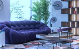
Instead, we get squiggles and curves and rounds and waves and blobs. The jellyfish aesthetic can absolutely be sophisticated, even elegant. But it can also be goofy, awkward, and childish.
This is one of the most important aspects of the design style. Mixing sharp edges and straight silhouettes into your home will squash the jellyfish vibe.
Of course, one can enjoy individual pieces that capture the jellyfish aura without revamping their whole space, like a goofy lamp or squishy chair.
Jellyfish move through water with an elegance that can sometimes feel clumsy. That kind of oxymoron is where the jellyfish aesthetic thrives.
Furniture pieces that suit this design style could be called silly or even perverse, as some pieces may take on a fleshy quality. But we can throw out any traditional ideas of elegance and, instead, embrace a new definition of luxury that leaves space for play and joy.
The Neons of the Sea
Color is another essential component of the aesthetic. If you create a space with nothing but squiggly shapes, curvy furniture, and plump decor, but it’s all in cream white, you achieve a marshmallow aesthetic, not jellyfish. Honestly, that sounds fabulous and yummy, but it’s not what I’m here to talk about.
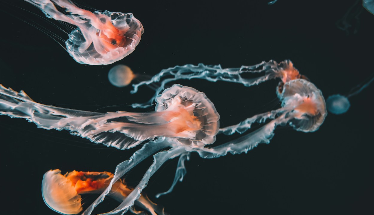
If you’ve ever seen a jellyfish, including pictures, you know these strange creatures come in mesmerizing colors. Even the “plain” white ones have a magical glow and neon feel.
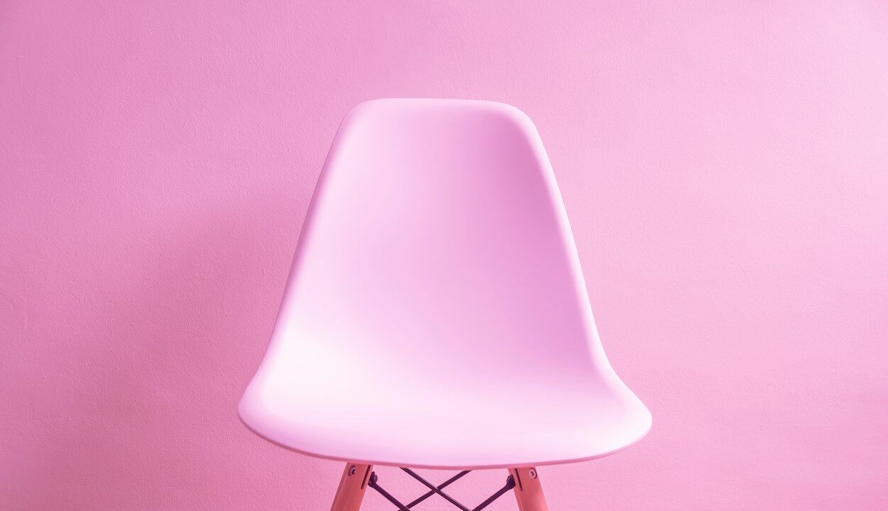
These stunning colors are part of the jellyfish aesthetic. Your whole home doesn’t have to be painted in blinding neon colors. In fact, we advise against that. Jellyfish colors are a dazzling amalgamation of neons and pastels.
You can use light, dainty hues, like ballerina pink, periwinkle, butter yellow, chartreuse, lilac, and meadow green. These can mingle with neons, like lime green, hot pink, and electric blue. When these colors come together, you get an enchanting, fairy-like palette.
As much as I love a decadent maroon or rich royal purple, those colors should be used very sparingly with this aesthetic. As far as tone, cooler colors are a safer bet, but you can incorporate warm hues, like coral pink and tangerine orange, without losing the jellyfish aura.
An Artsy Glow-Up
Jellyfish are one of the most striking and alluring creatures because they’re fluorescent. You can see their round tops float around in the dark ocean, giving them another layer of magic.
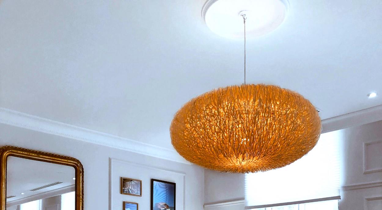
In almost every other situation, I encourage people to use warm lighting in their homes. It’s more flattering, cozy, and comfortable. But cooler and even fluorescent lighting (gasp!) can have a purpose for this style.
I still recommend caution when using this kind of lighting. Your entire space does not need cool, bright lighting to achieve the jellyfish aura.
Unorthodox lighting often works well for this concept. String lights, orbs, canopy lighting, or even floor lights can bring the vibe to life. The jellyfish vibes of a piece of furniture or decor can be amplified with the right lighting around it.
Neon signs are almost always a no for me, but for this aesthetic, some neon lights may be tastefully incorporated. However, I still think one is more than enough. When it comes to neon, a little goes a very long way.
Of the Past, Present, and Future
The jellyfish aesthetic is tricky to pin to any one era. At moments, it feels obviously of the ‘60s and ‘70s, with groovy, retro designs. But then, it also embodies trends we see on TikTok and Instagram — soft but bright colors, semi-retro feel, and artistic shapes. And yet, it also feels like something we might see in a movie set 200 years in the future.
The way this aesthetic resists a definite era makes it even more exciting and intriguing. Sifting in too many pieces strictly from a specific era can taint the vibe, so any obviously antique, vintage, or retro items might squash the aesthetic.
The Wabi Sabi of It All
Wabi-sabi is a Japanese design and lifestyle concept. It’s about accepting that life is imperfect and seeing that imperfection’s beauty and importance.
You must appreciate the organic look while embracing that anything organic is inherently imperfect, which only makes it more beautiful. You get the idea — perfectly imperfect.
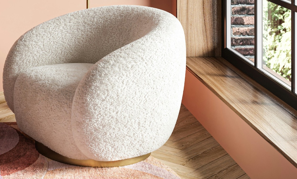
The Hiakrui design and lifestyle guide defines Wabi-sabi as the appreciation of the transient beauty of imperfect, impermanent, and incomplete things.
Chihuly and Koons’ work embodies this idea, as neither artist creates perfectly symmetrical or smooth pieces. The materials and process often determine Chihuly’s imperfections, as glassblowing is complex and delicate.
Koons, on the other hand, purposefully incorporates imperfections into his pieces. He could make a perfectly slick and even sculpture of a balloon animal. However, a real balloon animal won’t be perfect; it will have wrinkles, creases, crooked ears, and uneven legs. Koons puts these imperfections into his work. He puts them to work, giving the art more feeling and depth. I could explore the conceptual layers of Koons’ work all article long, but I won’t.
You can also see these beautiful imperfections in jellyfish. Their tentacles are uneven; their colors are marled; their tops are asymmetrical. Not only do jellyfish-inspired pieces not have to be perfect, but they’re better if they’re not.
Bringing Fun Home Again
I’m not sure why, but everyone in the 2000s and 2010s took themselves far too seriously. We lost a lot of playfulness in design and art, but not forever.
This bubbly home design trend is not an isolated incident, but the latest on an elongating list. We left behind sneakers resembling socks, like Toms, for “Dad shoes,” like the New Balance 2002. We tossed out our skinny jeans and filled our closets with mom jeans.
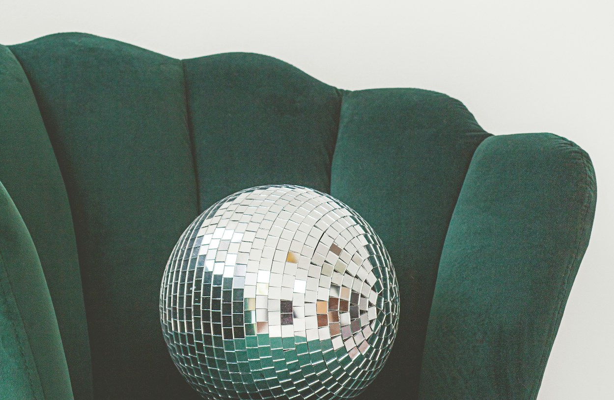
We’re leaving our sand-colored, serious, skinny design phase and heading into our cheeky, chubby, childish one, so get ready for some fun. And who knows what sea creature might inspire the next trend?

