If your glitchy touchscreen makes you want to hurl your phone across the Grand Canyon, you might be excited to hear that touchscreens are losing popularity and companies are bringing back buttons.
By no means am I saying we’re heading toward a touchscreen-less world, but buttons, dials, and knobs are making a comeback, and many are thrilled about it. From accessibility to safety to comfort, learn why some people loathe touchscreens and how buttons are popping up on our devices again.
Feeling Touchy About Touchscreens
Do people even like touchscreens? This is a tough question to answer. Some people enjoy touchscreens, and some people do not. However, the notion that all people prefer touchscreens to buttons in all situations is outdated.
We were all excited and impressed by the tech when it first appeared, giving us iPhones and iPads. But now, after decades of familiarity, the awe is fading. The number of posts and comments on Reddit bashing touchscreens is enough to prove that they aren’t for everyone.
Touchscreens are undeniably better for certain things, such as playing mobile games like Fruit Ninja and Temple Run. They’re also brilliant for photo and video editing. But despite what companies and manufacturers seem to think, touchscreens aren’t ideal for everything and everyone.
Whether people prefer touchscreens to buttons depends on many factors, but a common opinion is that both interactive styles have a time and a place, and a mix is helpful.
Anti-Consumer Cost and Quality

Touchscreens seem fancier than buttons and dials, but I’m not so sure that’s true. Yes, they look more futuristic in a sense, though in terms of quality, they usually fall short.
Touchscreens are not as durable as other types of physical controls, as they experience more concentrated wear and tear and aren’t made with tough materials. Touchscreens can break quite easily and malfunction in numerous ways. I’m not saying buttons can’t stick and break, but touchscreens are inherently more vulnerable.
Most people assume touchscreens, because of their advanced tech and fragility, are more expensive to produce. They’re almost always more expensive to purchase, so it stands to reason they cost more to make. But that’s incorrect. Touchscreens are much cheaper and easier to manufacture than physical buttons and dials, revealing one reason touchscreens are inescapable these days.
The Touchscreen Takeover
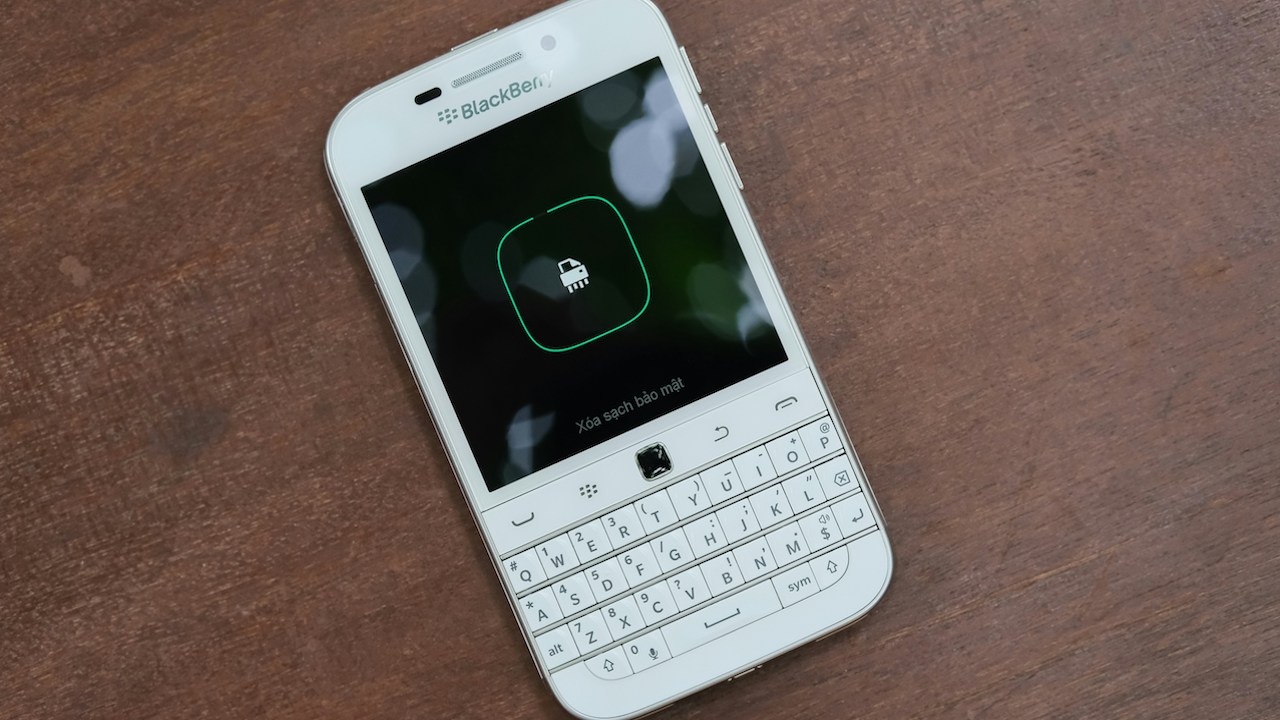
While certain folks may long for their Blackberry and despise their iPhones, most enjoy their touchscreen cellphone or tablet. But it’s the other places where touchscreens are popping up that grind people’s gears.
Now, we have to use touchscreens at airports, in grocery stores, at the car wash, at the ATM, in public transit stations, in restaurants, at parking meters, in retail stores, and the list goes on. While some may see this as the latest tech being used to its fullest potential, it’s frustrating for many. These touchscreens are typically not as smooth or functional as personal device screens, making them awkward and glitchy to use.
Furthermore, many of these devices and machines, such as ATMs, perform such simple actions that a touch design is unnecessarily complicated. However, the touchscreens showing up more and more in cars and other vehicles are one of the largest problems.
Insidious Infotainment

Cars have had touchscreens in them for decades now (my 2009 Prius had a touchscreen) but they’re getting bigger and more distracting, resulting in distracted driving and car accidents.
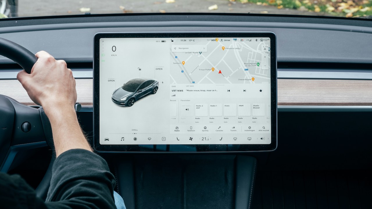
Newer vehicles from brands like Tesla have touchscreens more than a foot in width, sometimes up to 18.5 inches. I can’t think of anything more attention-grabbing than a laptop sitting in my line of sight while I drive. At this point, we’re all programmed to look at screens when one is in front of us. Even if we hate football and are trying to have a conversation at a sports bar, the screens still reel us in.
Studies have shown that using a touchscreen while driving slows the driver’s reaction time to the same degree that intoxication does. Certain research suggests that screens impair drivers more than alcohol does. The European Transport Safety Council announced that cars that only use touchscreens cannot receive a 5-star Euro NCAP safety rating.
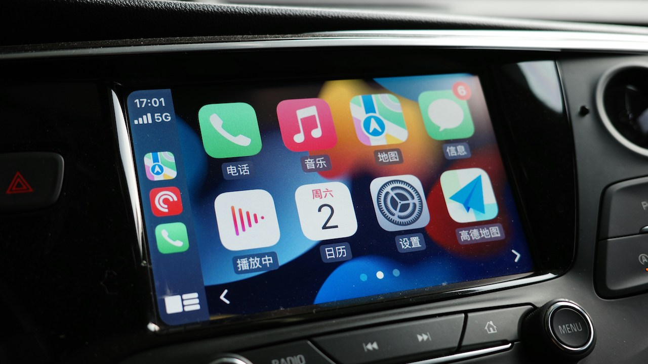
Car infotainment systems, such as CarPlay, are the most distracting. These programs were designed to make it easier for drivers to avoid looking at their phones, but have now become even worse. The systems are like having a giant smartphone strapped to your dashboard.
The small touchscreen in my 2009 Prius was a nuisance more than anything, with poor responsiveness and awkward navigation. Did it take me longer to find a radio station than in vehicles with buttons? Perhaps an extra second or two. But was the info on the screen so compelling that I’d look at it while driving for fun? Definitely not. It was boring. The newest screens are far too enticing.
The Need to Address Accessibility
A major aspect of this conversation that many people leave out is the accessibility of touchscreens. Not everyone can use these screens effectively. People with visual impairments, hand disabilities, or just dry skin struggle to use them.
Those with Parkinson’s disease or scleroderma struggle to operate the screens, and those with vision problems can’t feel around for the buttons. But even if you just have calloused hands or very dry skin, the screens might not register your touches.
Rather than factor these accessibility shortcomings into product designs, leading brands ignore these issues, leaving others to find ways to make the tech accessible. Products like BrushLens help people with disabilities use the screens. It doesn’t change that these accommodations are Band-Aids on a bleeding wound.
The more integrated touchscreens become in our daily lives (yes, they can be more prevalent) the less accessible the world becomes for these people. Engineers and manufacturers should address accessibility at the source, making products that work for everyone, rather than ignoring accessibility, which forces people to find third-party solutions.
Going Back to Buttons

Most of us aren’t trying to rid the earth of touchscreens, while we also don’t want buttons to go extinct. Many are asking for touchscreens to stop replacing already-comfortable controls, or to offer a mix of buttons and touch capabilities in products.
Whether someone has a disability, feels overwhelmed by the screens, or just misses the classic feel of turning a dial, they’re voicing their anti-touchscreen rhetoric. And certain companies are listening to customer complaints.
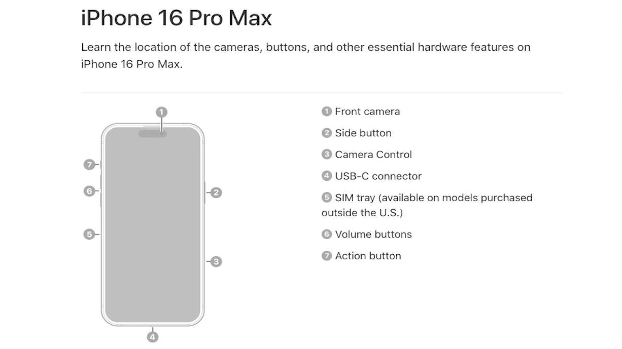
The new Apple iPhone 16 has the two volume buttons and one lock/power button we’re all familiar with. But they added two more buttons to this model: the Action button and the Camera Control Button. The former can be customized to perform whatever action you want, like turning on the flashlight. The latter opens the camera and offers some other photography controls. Apple even added physical keys back into its MacBook design at the top of the screen.
Kia, BMW, and Volkswagen are rolling back some of their tech a little, adding buttons and knobs to their newest vehicles following touchscreen laments. Reader brands that give people access to e-books are also bringing the buttons back. Kobo, Nook, and Boox have all reintroduced buttons to turn pages.
Pushing Their Buttons
If touchscreens have been pushing your buttons, the good news is that you’re not alone and change is coming. I highly doubt we’ll abolish touchscreens anytime soon, or ever, but we’re definitely seeing a shift in design expectations.
No matter how you feel about buttons, knobs, dials, and touchscreens, the best thing to take away from this shift is that consumer feedback matters. In this day and age, it seems that corporations lower quality and raise prices and care very little about how customers feel about it — likely because we’re forced to still shop there anyway.
But I feel a twinge of satisfaction knowing that major companies like Apple and BMW are listening to customer complaints and making changes based on them. Maybe there is hope for the average consumer yet.


